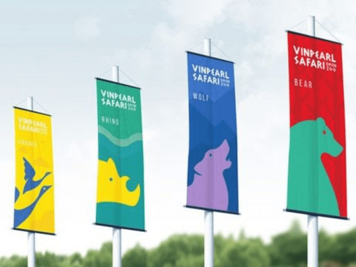
Are you looking to create an eye-catching banner that stands out from the crowd? You’re in luck, creating a great banner is easier than you might think. With just a few simple tips, you too can create an amazing banner that will draw people to your business or event. In this blog post, we’ll give you advice on how to design a stunning and attention-grabbing banner using colors, words, symbols, and shapes. So if you want to learn what it takes for effective and effective banners near me designs then read on.
Banners are one of the most effective ways to grab the attention of your audience and promote your brand. They are visually enticing and can convey messages quickly and succinctly. However, designing a banner that stands out from the crowd can be a challenge, especially when you are competing with other businesses for your customer’s attention. In this article, I will share some tips for designing eye-catching banners that will help you stand out in the crowd.
Keep it Simple
One of the most important things to keep in mind when designing a banner is to keep it simple. The more cluttered and complicated the design, the more likely it is that your audience will ignore it. Use bold and simple images and typography to convey your message quickly. Make sure the text is easy to read from a distance, and avoid using too many colors.
Use High-Quality Images
The images you use in your banner can make or break its success. Make sure that the images you use are high-quality and relevant to your brand or message. Avoid using low-resolution or poor-quality images as they will give your banner a cheap and unprofessional look. If you don’t have the resources to create your images, consider using stock photos that match your brand.
Pick the Right Colors
Colors are a powerful tool that can evoke emotions and attract attention. When designing a banner, it’s essential to choose the right colors that match your brand and message. Use bright and bold colors to grab attention, but make sure they don’t clash with each other. Stick to a color palette that matches your brand, and avoid using too many colors.
Focus on Your Message
Your banner’s primary goal is to convey a specific message to your audience. Make sure that your message is clear and easy to understand. Use typography that is easy to read and avoid using long sentences. Keep your message concise and to the point, and make sure it’s the focal point of your banner.
Test Your Banner
Before you launch your banner, make sure to test it out to see how it will look in the real world. Print it out and place it where you intend to use it, whether it is a trade show, event, or storefront. Test it from different angles and distances to see how it looks from every angle. Get feedback from others to see what they think and make any necessary tweaks.
Conclusion
By following these tips, you can make sure your business is always in the spotlight with your eye-catching banners! Not only will they attract attention and showcase what you offer, but they will also provide you with a great way to get your message across. Investing in quality custom signs that will last for many years is a key element in creating effective banner designs. Michigan Custom Signs has an abundance of styles to choose from and ensure you create an advertisement that stands out from all the rest. Take control of your brand’s visibility today and create something that will immediately draw attention – contact Michigan Custom Signs today.


