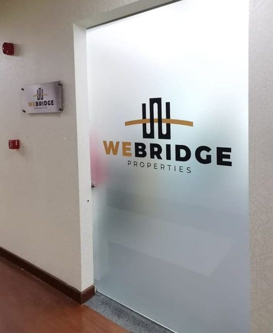
Are you looking for a way to make your office door signs stand out from the rest? You may have noticed that many businesses are now using unique, catchy signage to welcome their customers and give them style points. Well, if you’re feeling uninspired when it comes to adorning your own office doors with eye-catching signage, we’ve got just the tips you need! In this blog post, we’ll be discussing how best to design your office door signs in order to make sure they grab attention and add a bit of character. So read on and let’s get started.
When it comes to running an efficient office, every little detail can make a difference. One detail that can often be overlooked is the door signs that guide employees and visitors throughout the space. These small signs may seem unimportant, but they can have a big impact on the overall look and feel of your workplace. In this blog post, we’ll go over some helpful tips on how to create office door signs. That stand out and make a positive impression on anyone who enters your building.
Think About Your Branding
When designing your office door signs, it’s important to consider your branding. What colors, fonts, and images are associated with your brand? Incorporating these elements into your signs can help reinforce your company’s identity and create a cohesive look throughout your space. If you’re unsure where to start, consider working with a graphic designer or branding expert to help you create a design that best represents your company.
Keep it Simple
When it comes to designing door signs, less is often more. Remember, these signs are meant to be functional first and foremost. Make sure the text is clear and easy to read, and use a font that is both professional and legible. Avoid cluttering the sign with too much information or graphics, as this can make it harder to read and understand.
Consider the Material
The material you choose for your door signs can also make a big difference in their appearance. While paper signs may be more affordable, they can look flimsy and cheap. Consider investing in signs made from higher-quality materials such as metal or acrylic. Not only will these materials look more professional, but they will also last longer and require less frequent replacements.
Use Contrast
Another important factor to consider when designing door signs is contrast. A sign with high contrast – such as black text on a white background – will be much easier to read than one with low contrast – such as light grey text on a white background. Make sure the colors and fonts you choose create enough contrast so that the sign is easy to read from a distance.
Get Creative
While it’s important to keep your door signs professional and functional, don’t be afraid to inject a little bit of creativity into them as well. Adding an interesting graphic or a unique shape can make your signs stand out and leave a positive impression on visitors. Just make sure not to go too over-the-top with your design choices, as this can detract from the sign’s primary purpose of providing clear direction.
Conclusion
You should now have a better understanding of how to make your office door signs stand out and get noticed. Utilizing the tips mentioned in this blog post, you can create custom office door signs that reflect your company’s unique brand identity. Whether you opt for metal or wood, bold bright colors or subtle ones, dimensional signs or flat ones – remember that the most important thing is to make sure your door sign reflects professionalism and is durable enough to withstand daily wear and tear.
For an experienced sign maker with the knowledge to make your vision a reality, contact Michigan Custom Signs. Their team of experts will help you create the perfect office door sign for long-lasting impact and maximum visibility. With their help, you’ll easily meet and exceed all safety standards while creating attractive products that not only look good but will also stand up against tough conditions. So don’t wait any longer – contact Michigan Custom Signs today.


