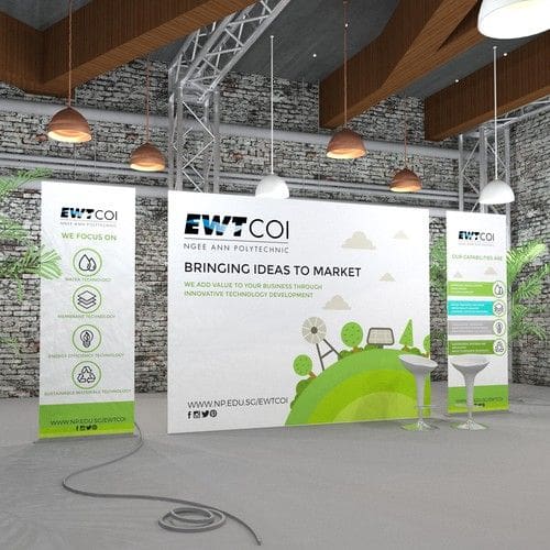
As conference organizers and event planners, it’s important to make sure each event stands out. During conferences, one of the best ways to do this is through effective signage that helps draw attendees in while delivering an exciting and memorable atmosphere. By incorporating innovative signage into your next conference or trade show, you can transform a bland experience into something grand. Today, we’ll discuss everything you need to know about creating impactful event signage that will leave a lasting impression on guests. Learn what materials are best for special effects, how to choose colors for maximum visibility and eye appeal, and creative techniques for enhancing the overall look of your next gathering just with signs!
Capture your audience’s attention
Having great signage is essential to transforming a bland conference into something truly grand. Of course, there are many elements to consider when it comes to choosing the right signage for your event. Here are some tips that will help you create innovative and impactful signage that will capture your audience’s attention and turn a mundane occasion into an unforgettable one.
Choose Eye-Catching Colors
Colors have the power to evoke strong emotions in people so use them wisely when designing your signs. A combination of bright colors infused with subtle shades can create eye-catching contrasts that guarantee a “wow” factor from your attendees. Also, keep in mind the message you want to convey with these colors — vibrant tones suggest energy while delicate hues connote sophistication or elegance; thus allowing you to tailor-fit each color combination according to the specific goals and needs of each sign without compromising on the visual appeal and legibility potentials.
Opt For Impactful Images
The visuals used on any sign should be clear, bold, and meaningful enough for maximum impact because even if all other design features are perfect but if the image does not hit home then your efforts have gone in vain! So pick unique yet relevant images that complement both the content as well as the overall concept of each sign — stock or original photos, silhouette figures, illustrations, etc., all can be used depending upon what type of impression is needed; so let creative juices flow and see which imagery best fits each individual tasks at hand!
Exhibit Professionalism With Font Selection
Last but definitely not least — fonts! Even though one might think stock fonts would suffice for creating signs however tremendous differences can be made by using appropriate typography since font selection greatly affects how others perceive our message; plus given the amount of choice available today there really is no excuse not to… just make sure chosen font families match primary text style across all designs while also accentuating/supporting core theme through secondary/complementary ones!
Make your conference memorable
By taking these key points into consideration when selecting wisely yet amazing signage solutions for any type of conference or presentation the success rate jumps up exponentially setting the stage perfectly conducive environment where attendees look forward eagerly to participating instead of dreading it!
Let’s take this opportunity together to come up with a design extravaganza making every single show full of memorable experiences. For your next conference signage needs don’t forget to contact Michigan Custom signs. Feel out the form or give us a call at 248-397-6642 and get expert advice!

